MIRO
Miro is a design-led radiator brand redefining the role of heating within the modern home. Combining refined craftsmanship, premium materials, and distinctive aesthetics, Miro creates radiators that unite exceptional performance with enduring style. Designed to be both a heating solution and a statement piece, each collection brings functional luxury, warmth, and character to contemporary living.
01/ CORPORATE
IDENTITY SYSTEM

" Refined Heating "


" Refined Heating "
Maroon
Yellow
Green
01/ DIGITAL TOUCHPOINTS
The Strategy: I designed a comprehensive suite of digital marketing assets to launch the brand across online channels. This included building responsive web banners, dynamic digital layout templates, and structured promotional grids engineered to capture immediate customer attention and convey a premium brand message while also keep structure and visual hierarchy amongst the brand and sister brands.






01/ ART DIRECTION &
PHOTOGRAPHY STYLEBOARDS
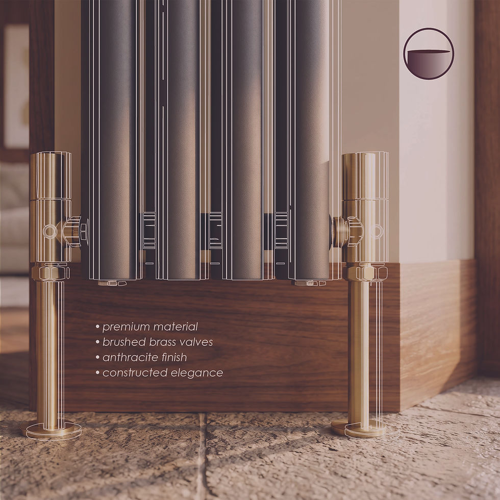
The Strategy: To establish Miro’s premium visual identity, I created clear guidelines and art direction for the brand's product imagery. I developed tactile style boards and photography guidelines that detail how the finishes, lighting, and modern interiors interact on camera to guarantee a high-end, unified visual presence. Introducing detail lifestyles to the brand to create elevated and premium visuals that can be repurposed on multiple platforms and asset designs.


ACCENT
Accent is a hybrid café, library and archive designed for quiet minds and creative energy. The concept is inspired by teal, a colour that sits between blue and green, calm and curious. It's never the loudest shade in the room, but the one that completes the picture, and that's exactly what Accent aims to be: not a destination that demands attention, but a space that adds something meaningful, like books and good coffee:)
Visually, the brand blends retro surrealism with a touch of 90s athletic aesthetics, reimagined with a modern clarity. A bold, and dynamic typeface giving a sense of nostalgia..maybe?
Accent is intentional, warm and quietly dynamic, a rhythm in the background that helps people slow down, think clearly and create without the noise.


EVERY BODIES GYM
Every Bodies Gym is dedicated to creating a welcoming and comfortable space where people can achieve their health goals without feeling insecure or overwhelmed. They focus on supporting neurodivergent individuals by designing less stimulating environments that encourage inclusivity, community, and positivity truly fits their tagline “The gym for people who don’t like the gym.”


Focusing on easily adaptable and live brand. That can be translated and repurposed on multiple platform and touchpoints.
ReBRAND: ULYSSES
Re-branding Ulysses by James Joyce.
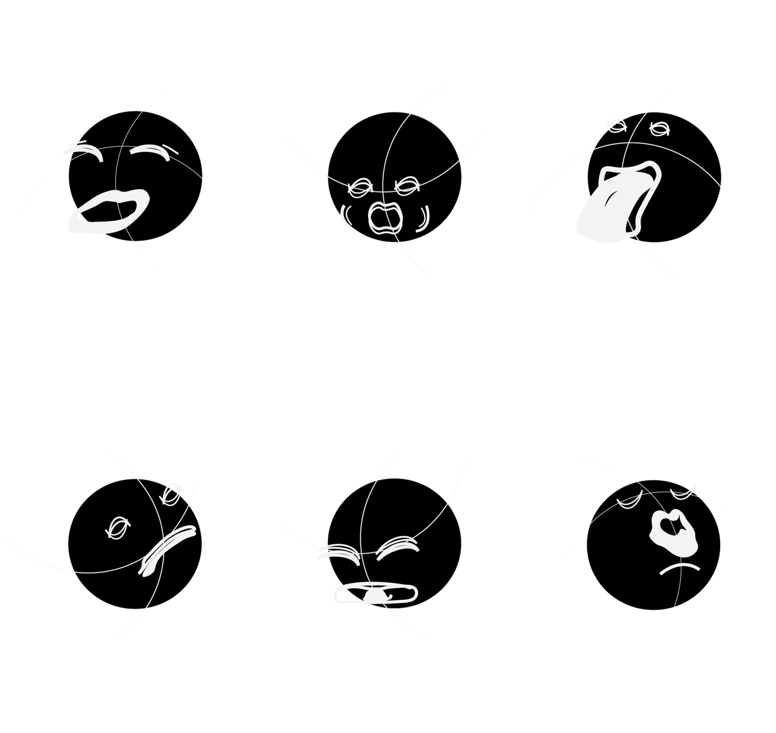
Inspired by the author’s unique six-beat rhythm and poetic style, I created digital characters and figurines that are visually mouthing the flow and movement of the spoken verses, bringing the poetry to life.
CRIED /
CR-II-EE-D
/KRYD
TO / T-O/ ! / TO
Inspired by ongoing trend of collectibles. I designed digital interactive characters that present a unique experience of the poem in phonetics . Mimicking the mouth and sound in a humouristic way

BRONZE /
BRON-Z-UH !
/ brɒnz
AND A / A-ND AA /
AND-UH
PITY / PI-T(!)-I
/ PI.TEE

